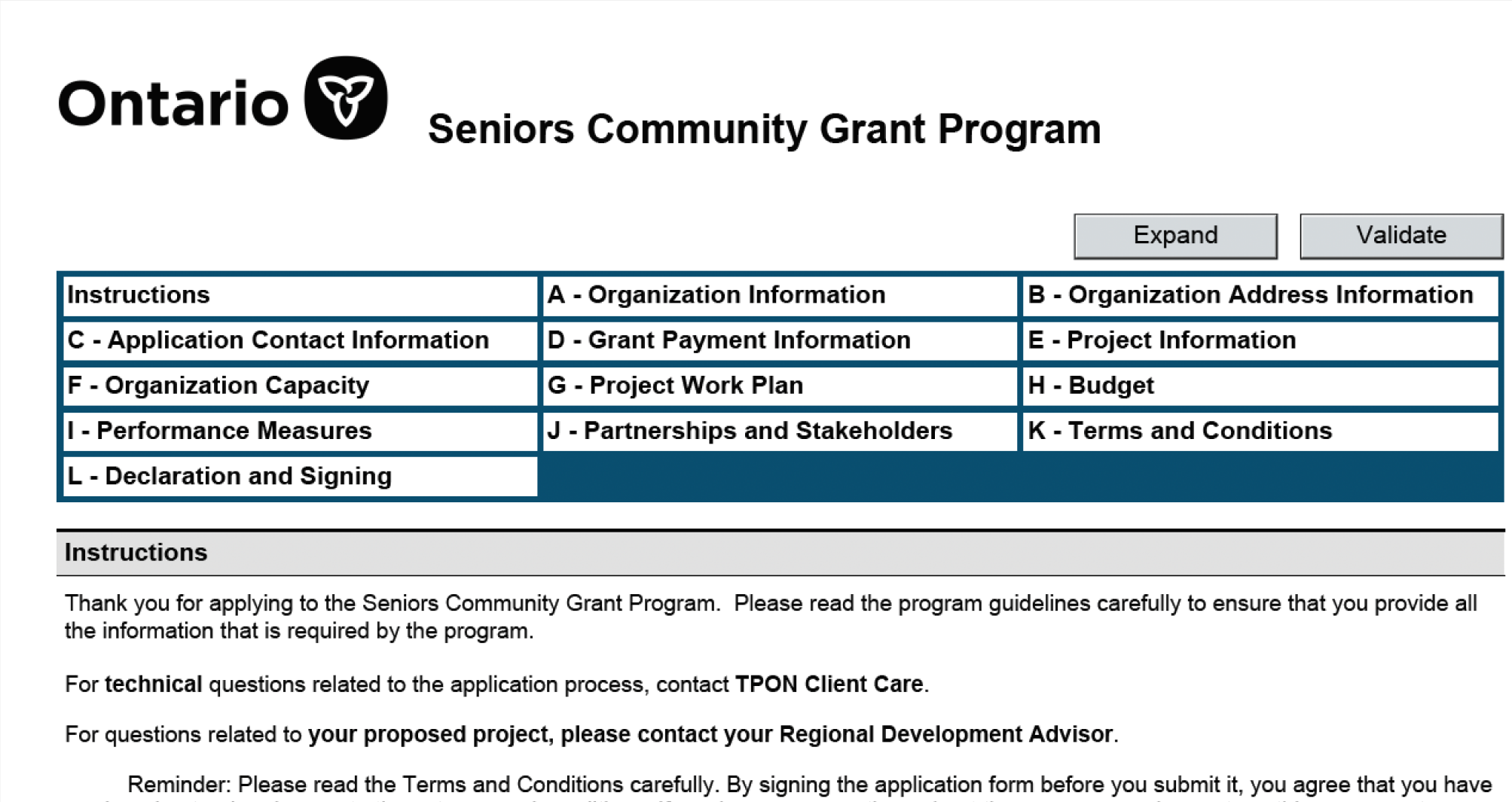
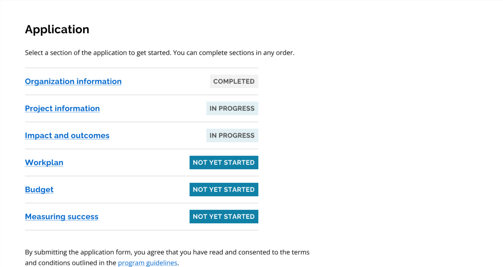
Seniors Community Grants project hero image

A refreshed Seniors Community Grants form

Ontario offers grants that fund community projects for seniors (55+). 30-40% of application submissions are completed incorrectly. Applicants are disheartened. Evaluators are frustrated. How do we envision a new form?

Role
Researcher Co-lead
Design Lead
Timeline
4 months
Clients
Ministry of Seniors and Accessibility
Ministry of Tourism, Culture and Sport
Team
Andrea Gonzalez
Andrea Gonzalez
UX Designer
Dana Patton
Dana Patton
Service Designer
Esi Aboagye
Esi Aboagye
Content Designer

PROBLEM

Poor form design results in 30–40% of applications being completed incorrectly, leading to delays, rejections, and project cancellations. This undermines the very purpose of the Seniors Community Grant program.

"This is a program for seniors and about seniors. Applicants propose phenomenal projects that will improve lives. Because they have to face this application, funding is delayed, and they have to cancel their projects. We're setting them up for failure."

— Grant Evaluator


PROCESS

With limited time before the next funding cycle, we structured our work into two phases:

  1. 1
    Immediate usability improvements
    Addressing critical usability issues based on heuristic evaluation.
  2. 2
    Long-term structural changes
    Conducting stakeholder research and co-creation to inform a more substantial redesign.

HEURISTIC EVALUATION

Drawing from my experience leading best form practices in the Ontario Design System team, I conducted a heuristic evaluation to surface quick wins:

Form with incredibly small text fields for a Project Work Plan
1

More flexible fields

Expanding small text fields and allowing additional rows where needed.

Form fields for Grant Payment Information, with description "Should your application be successful, this information will be used to make payments.
2

Remove irrelevant sections

Removing premature payment information requests (before applications are approved).

Form input requesting Salutation and Phone Number for Work and Mobile
3

More inclusive guidelines

Using gender-neutral terms and simplifying contact requirements.

Guidance document listing out eligible expenses, not part of form.
4

Embedded guidance

Reducing reliance on a separate 22-page document by providing necessary information in the form itself.


STAKEHOLDER RESEARCH: Focus group

To address deeper structural issues, I led a focus group with 5 grant application evaluators to understand their experience.

I chose a focus group because it is time efficient and encourages evaluators to build on each other’s insights. I structured the session with a script and clear time clues to keep us focused, but ultimately left it flexible when there was productive organic discussion. I facilitated balanced participation by prompting the evaluators who spoke up less often.

The discussion revealed deep frustration among evaluators, who had long asked for a redesign. The outdated form created extra administrative work for evaluators and discouraged applicants from reapplying.

"Of course they become disheartened. I can tell you, we have project teams who never want to work with us again. And I can't blame them."

— Grant Evaluator

Evaluators were making up for the faults of the form by reaching out to applicants and manually correcting their forms, which they did not always have the time to. This key insight shaped our next steps, highlighting the need to bridge the gap between applicant expectations and evaluation criteria.

STAKEHOLDER RESEARCH: Question protocol

To systematically streamline the form, I advocated for a question protocol workshop with the same 5 evaluators.

Using Miro, I led an online session where we assessed each question by asking:

  1. 1
    Who uses this answer?
  2. 2
    When is this answer needed?
  3. 3
    How does this answer impact funding decisions?
  4. 4
    What common errors do applicants make when answering this?
  5. 5
    What happens if the question is incorrectly answered?

This structured approach helped us eliminate redundant questions and clarify essential ones, significantly reducing form length.


USER RESEARCH

To uncover precisely which parts of the form caused confusion, our team conducted 13 highlighter test sessions with past applicants. Participants included both applicants who had been rejected or received funding in past applications.

A google document showing instructions for a highlighter test.

Past applicants marked content as:

  1. 1
    Green: Clear and helpful
  2. 2
    Yellow: Unclear or confusing
  3. 3
    Red: A stopping point that prevented progress

Initially, I set up a Google Doc with the form text. I intended to observe participants as they read and highlighted sections. However, some struggled with using the tool. To ensure a smoother experience, I quickly adapted by having participants read aloud and denote colours, while I had an assistant highlight the text on their behalf. This adjustment made the process more inclusive, accommodating different levels of tech comfort.

This research surfaced critical usability barriers:

Inaccessible format

Inaccessible format

The form was not compatible with most PDF viewers, causing technical difficulties for many applicants.

Fragmented structure

Fragmented structure

Repeated questions and poor flow across sections led applicants to doubt that they answered correctly.

Ambiguous questions

Ambiguous questions

There was a mismatch between how applicants understood questions and the answers evaluators expected, particularly concerning project objectives and priorities.

Opaque criteria

Opaque criteria

Applicants did not know what to prioritise. For instance, it was not clear to applicants that evaluators placed high importance on organisational capacity and sustainability.

Irrelevant sections

Irrelevant sections

Some compulsory questions were not applicable to all projects.

Complex language

Complex language

Jargon and unclear language posed additional challenges for applicants.


GUIDING DESIGN PRINCIPLES

From our research, I distilled 4 key design principles that guided our redesign:

  1. 1
    Relevance – Ensuring every question serves a purpose, based on our question protocol.
  2. 2
    Clarity – Making content easy to understand, informed by our highlighter testing.
  3. 3
    Transparency – Bridging gaps between applicant expectations and evaluation criteria.
  4. 4
    Flexibility – Accommodating diverse projects and applicant needs.

COLLABORATIVE REDESIGN

Inspired by their passion, I hosted a co-creation workshop with 4 evaluators and 2 applicants, giving them a direct role in shaping the new form.

I facilitated the session by:

  1. 1
    Introducing Miro, ensuring all participants were comfortable with the tool.
  2. 2
    Sharing our guiding design principles and analysis of each form section.
  3. 3
    Leading a brainwriting exercise, allowing participants to generate ideas silently before sharing and refining them together. I wanted to encourage equal participation, especially empowering the applicants to contribute more freely.
  4. 4
    Synthesized collective insights and shared final artefacts, ensuring every participant had a tangible record of their contributions.

This collaborative approach fostered alignment between applicants and evaluators, leading to a more user-centred form redesign.


prototyping

I created a Figma prototype of a reimagined grant application driven by our guiding principles. Insights from co-creation directly shaped the prototype, ensuring changes reflected real-world needs.


ADVOCACY

Government redesigns require more than just better design; they demand advocacy, policy shifts, and structural change. By working closely with the Ministry of Seniors and Accessibility, we achieved 3 key outcomes:

1

Transition to modern webform

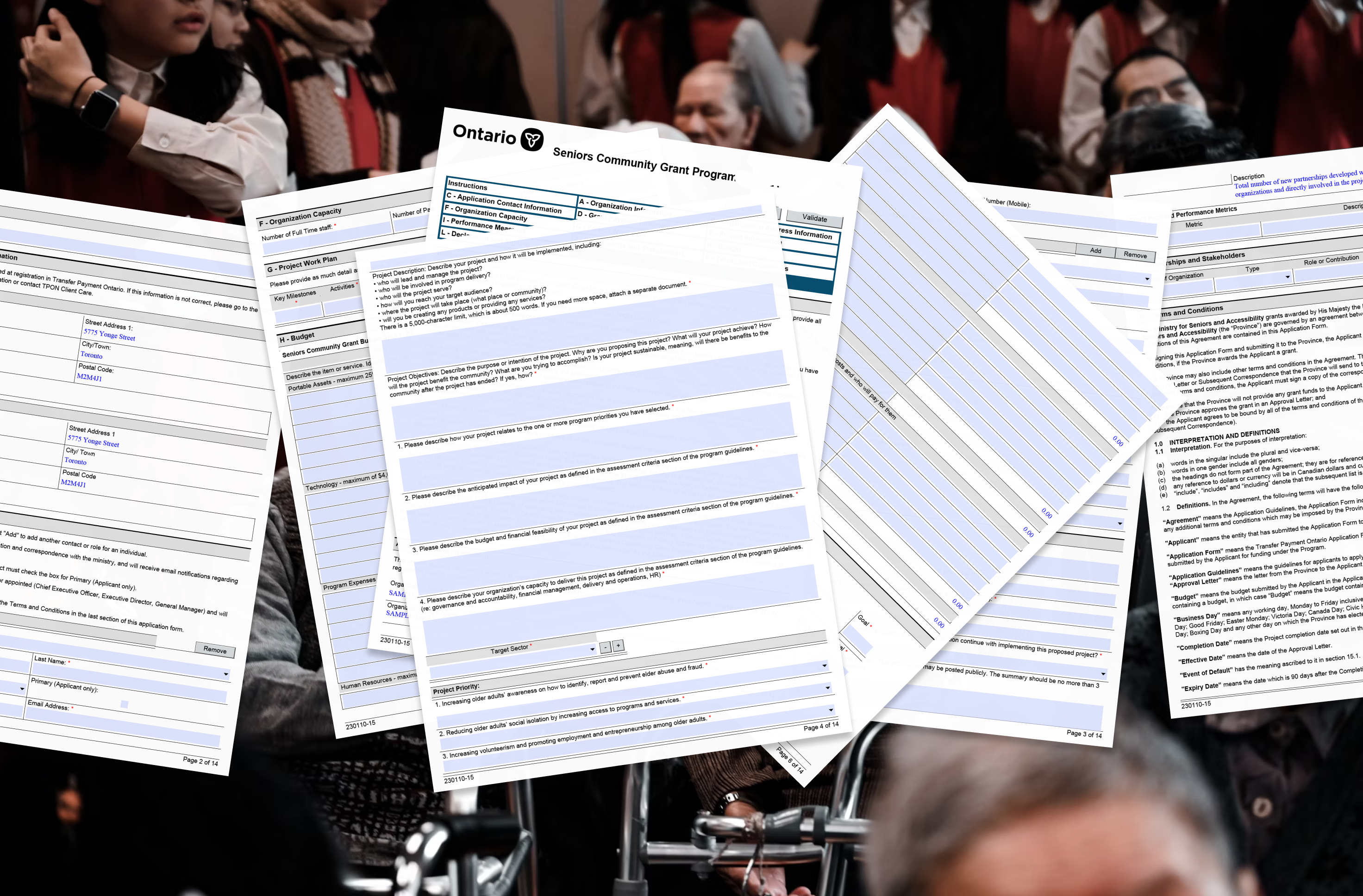
We successfully made the case for moving to a modern webform using the Ontario Design system, although the ministry team anticipated that full implementation could take years.

The webform prototype I created was instrumental to address hesitations and secure buy-in. It highlights the potential for increased accessibility, adaptability to future policy change, and greater ease of maintenance.

2

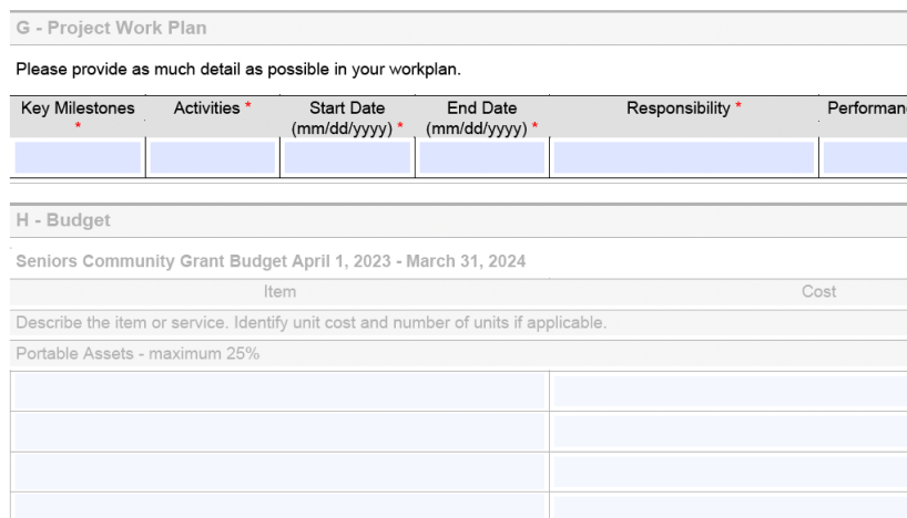
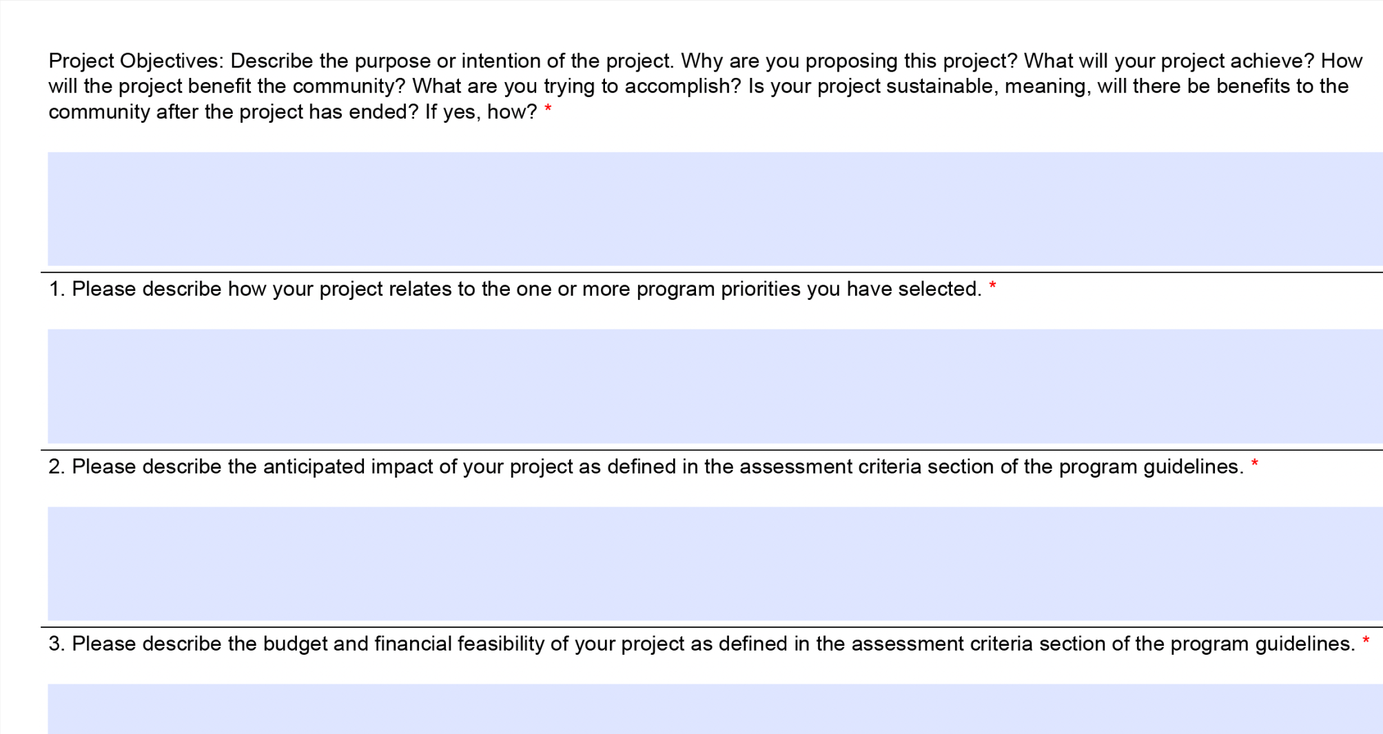
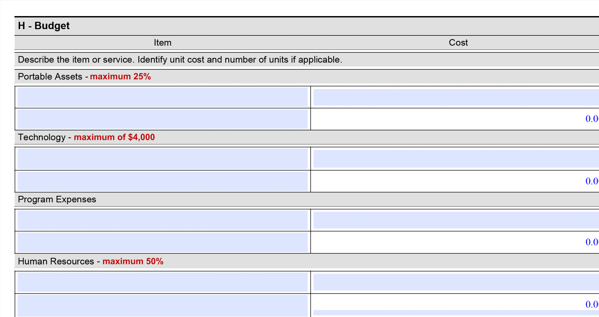
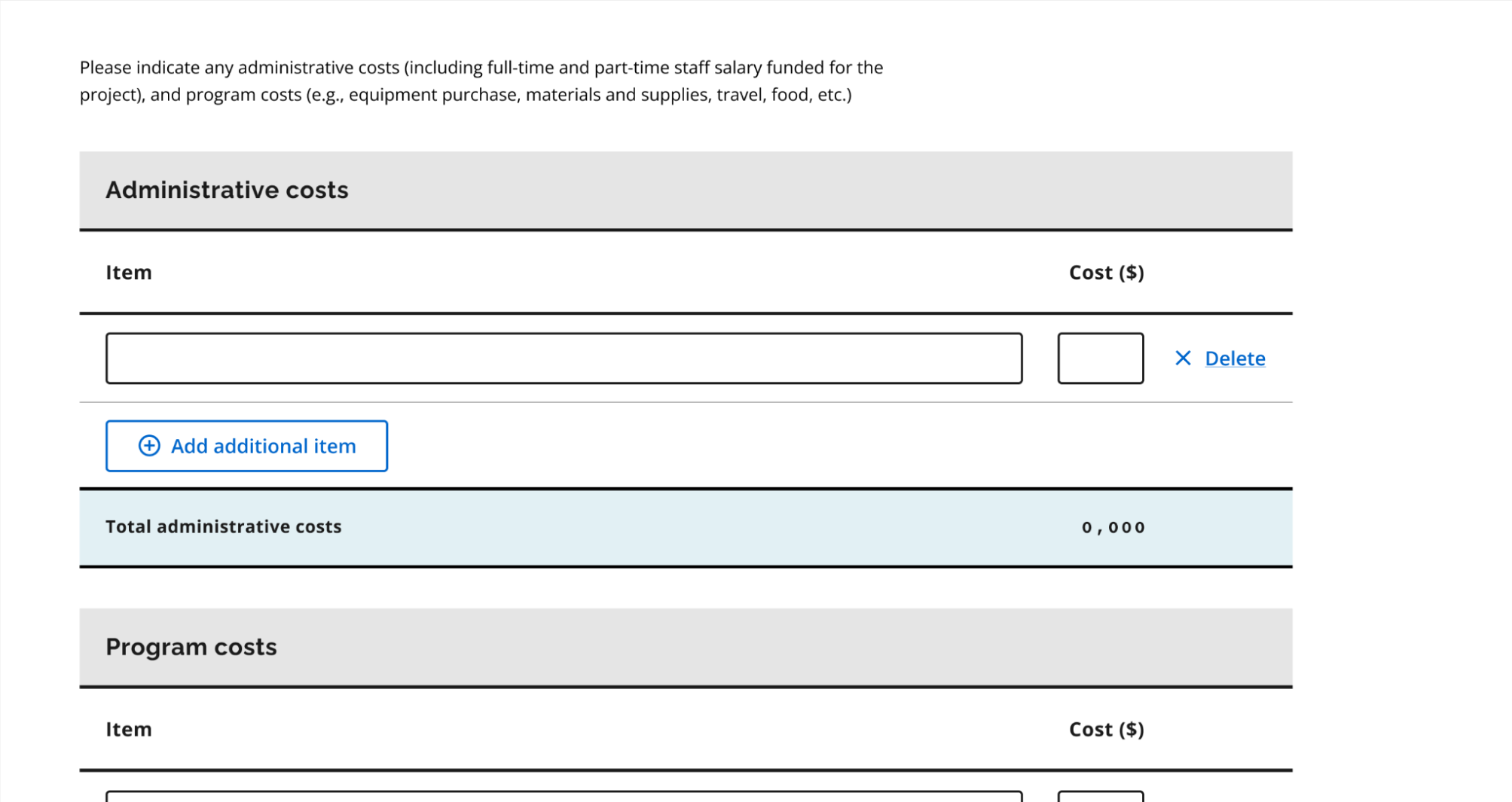
Policy changes to budget

Initially, stakeholders resisted revising the budget categories, insisting that the budget categories had always been structured this way.

When I probed further, I found no substantial reasoning behind the rigid structure.

As a result, we secured policy changes that allowed applicants more flexibility in budget allocation, making the process more inclusive and reflective of the diversity of community initiatives.

3

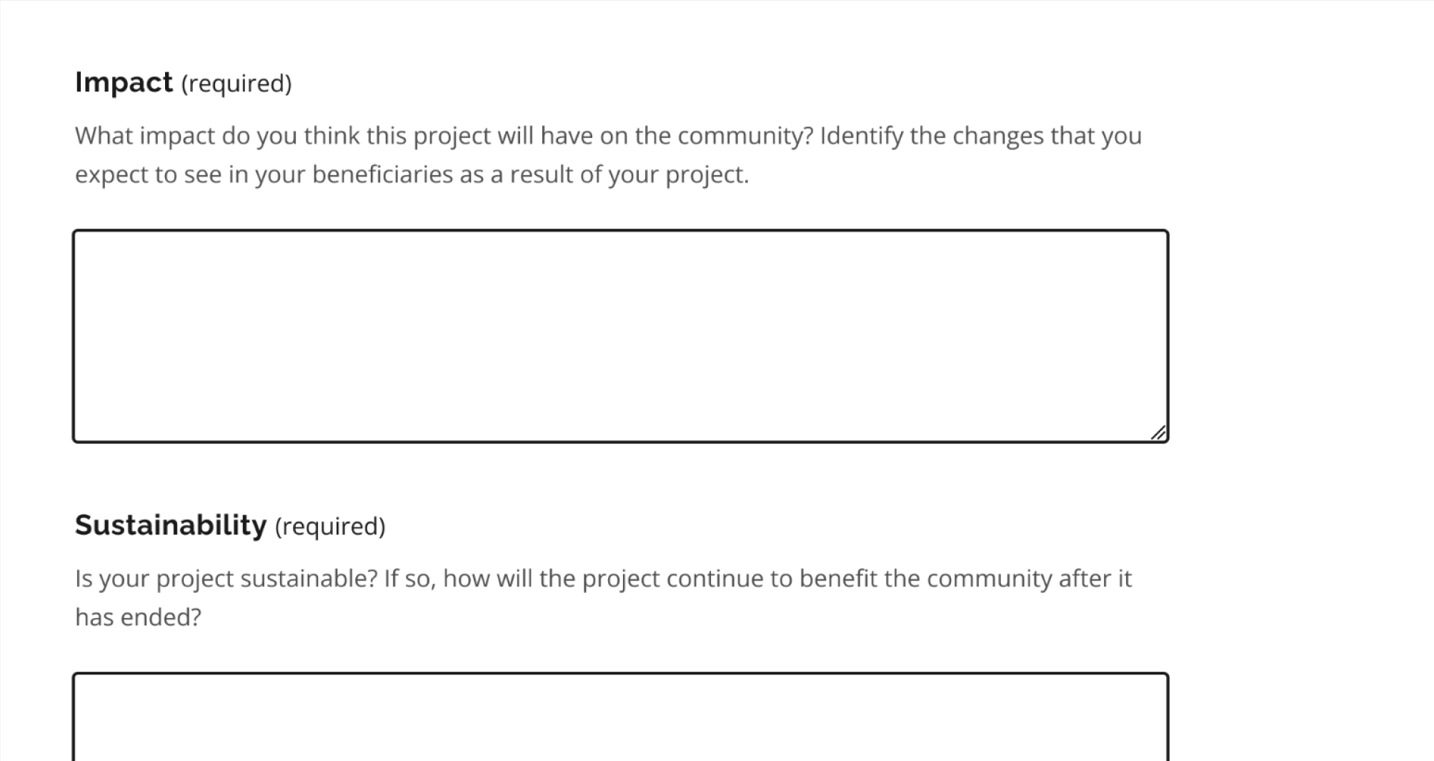
Revised evaluation process

The transformation of the form meant that evaluation processes also needed updates.

This fell outside the direct scope of our collaboration, so we couldn't overhaul the evaluation process itself.

We focused on revising evaluation criteria, laying the groundwork for a clearer, fairer assessment framework. We also gained the evaluation team’s commitment to further internal refinements.


TAKEAWAYS

Challenge the status quo for transformative change

Many of the application’s biggest pain points, such as complex budget categories, ambiguous evaluation criteria, and an outdated form structure, persisted simply because "that’s how it’s always been done."

By questioning long-standing assumptions, we were able to drive user-friendly improvements that wouldn’t have happened otherwise. This project reinforced that I have to continue challenging entrenched practices, advocating for systemic change, and aligning with organisational priorities.

Seeing genuine human connection and imagination translate into tangible change, even within bureaucratic constraints, proves that transformative design is not only possible, but so, so worth it.